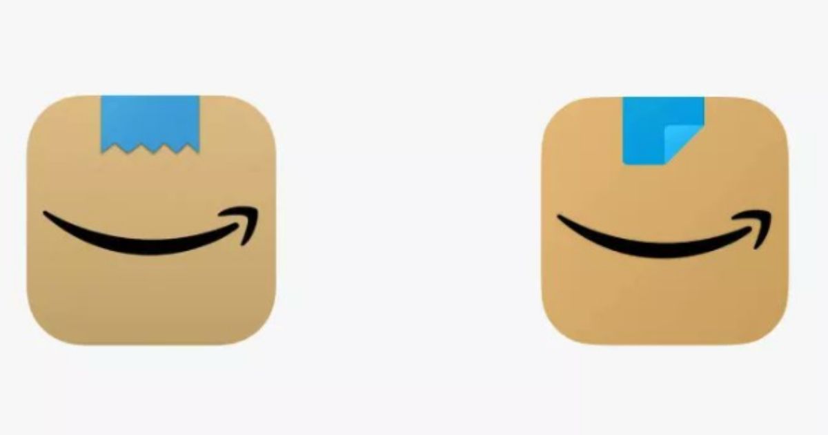
Amazon tweaked its new app icon after people pointed out that the earlier version resembled Adolf Hitler.
The e-commerce giant introduced the first iteration of the new icon in January, replacing the shopping cart symbol.
The January version of the icon featured a brown box with a jagged piece of blue tape above the company’s smile-shaped arrow.
Critics quickly noticed that the tape resembled Hitler’s toothbrush mustache.
“Amazon’s new app logo be looking like they’re the THIRD most downloaded in the “Reich” section,” tech analyst Jon Prosser tweeted.
Amazon’s new app logo be lookin like they’re the THIRD most downloaded in the “Reich” section. pic.twitter.com/znvvfQ5nst
— Jon Prosser (@jon_prosser) January 25, 2021
Twitter user Willi Kampmann added that it “looks like a happy little cardboard Adolf to me.”
It’s not just a ripped scotch tape, it’s a ripped scotch tape that has a similar shape and is right on top of a smiling mouth. Looks like a happy little cardboard Adolf to me
— Willi Kampmann (@willikampmann) March 1, 2021
Alex Hern, a technology editor at the Guardian, pointed out on Twitter that Amazon quietly tweaked the logo.
The updated version makes the blue tape unjagged and folded over.
“lmao I completely missed that amazon quietly tweaked its new icon to make it look… less like hitler,” Alex Hern tweeted.
“unsurprisingly they did not send out a press release to announce the second redesign.”
unsurprisingly they did not send out a press release to announce the second redesign
— alex hern (@alexhern) March 1, 2021
Amazon told the fact-checking site Snopes that it updated the logo in response to customer feedback, but it is unclear if the change was related to users who compared the tape to Hitler’s mustache.
[firefly_poll]
“Amazon is always exploring new ways to delight our customers,” a company spokesperson said. “We designed the new icon to spark anticipation, excitement, and joy when customers start their shopping journey on their phone, just as they do when they see our boxes on their doorstep.”
This is the first update to the mobile icon in over five years and will be visible once users update their applications.
The update also includes a new bottom navigation, simplified top navigation and a different color scheme.
This article appeared originally on The Western Journal.


 Continue with Google